Page Card
Hearing Curves
Belongs to subject Hearing Curves
We do not perceive sounds evenly over the frequency range. At the same amplitude, we perceive some frequencies as louder than others. We call a graph that shows how our hearing varies over frequency and amplitude, a hearing curve. Often, these hearing curves are shown as equal-loudness contours. Meaning, how would you have to change a sound in order to have the sound appear 'neural' to our ears? Historically, we called these graphs Fletcher-Munson curves, but updated models are available.
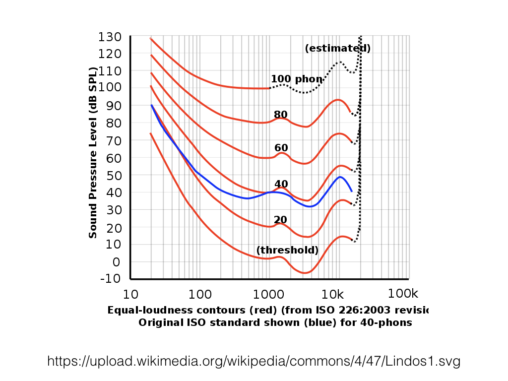
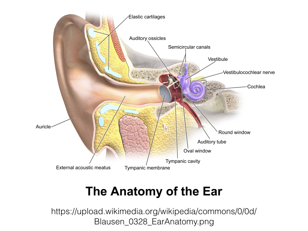
We do not perceive sounds evenly over the frequency range because of two primary reasons. First, our anatomy. The ear is shaped to be more sensitive to certain bands of frequencies. Which leads to the second reason. We are most sensitive to specific bands of frequencies because those bands are more important to us to survive. In particular, the range in which human voices project is our clearest area of hearing.
There's two ways to interpret this sensitivity. First, frequency. We're particularly poor at hearing frequencies below 100 Hz and above 10,000 Hz. The range between 1.5 kHz and 5 kHz is the area we perceive as the loudest; with the maximum being around 3.5 kHz.
The second interesting parameter here is amplitude. At the loudest part of our range, 100 dbSpl and above, our sensitivity over frequency has less variation. At our regular hearing level, 60-70 dbSpl, there's a moderate amount of difference in perceived volume. As the sounds become softer, the difference in volume over frequency grows tremendously.